Yes, Windows scaling is still a hot mess in 2022
When I switched from Node.js to .NET, I decided to do it with my trusty MacBook Pro. Still, I was intrigued by Visual Studio - a de-facto Windows exclusive - being the "official" .NET IDE. So in December 2022, I finally decided to give Windows another shot after more than ten years. And as you've already probably got, it didn't end so well.
TL;DR Windows itself scales well nowadays, but it messes up all the proportions between the UI elements. And that dives me nuts!
No project starts without a bit of drama, and this time was the case of choosing an appropriate laptop. In my mind, the build quality of a MacBook and the pleasure of macOS are inseparable, so - to be fair - I knew I had to get a laptop that was of equal quality or higher. And that happened to be a full-blown ThinkPad X1 Carbon Gen 9 with an Intel i7-1165G7, 32GB of RAM, 1TB of fast SSD, and a gorgeous 14" 4K (3840x2400) 500nit display. A pretty sweet machine, if you ask me.
Knowing my ThinkPad-fanboy side, this was the only right choice. I would have rejected anything else just after touching it. But unfortunately, even with this much investment, things started cracking down just minutes after I looked at the screen, courtesy of Windows 11.
The boring technical stuff
I think many of you are already familiar with the concept of DPI, but for those of you who don't, let me recap real quick.
The main idea is that regarding screen resolution measures, what we call resolution, is just half the story.
For example, a standard classic "Full HD" monitor has a resolution of 1920x1080. Is this good or bad? Well, it depends on what size of monitors you spread it on! It's perfectly usable if we were talking about a 24" display, but maybe it will look a bit grainy on a 40" TV or look unreadably small at native resolution on a 10" display.
I have no fancy graphs to show you. Still, using imagination, if you think about putting the same amount of pixels in a smaller area, they need to be physically smaller, yielding smaller graphical elements and vice-versa.
So this example introduces you to two concepts.
The first is pixel density, or the number of pixels in a defined screen area. I don't know the exact math, but the idea is that it combines in a single measure called DPI (dots-per-inch) both what we call resolution (e.g., 1920x1080) and the size of the monitor itself. This way, we can make more fair comparisons between monitors of different sizes. (If you are interested in this subject, I suggest you this handy website I use to calculate DPI and reference existing panels' DPIs for reference.)
The second concept is scaling, or the fact that - in some situations - screens are so dense that we need to scale their content so that it becomes readable. For example, a 2x scaling means using four physical pixels to represent a virtual (also called scaled) one. We can have integer-factor scaling (e.g. 1x - also called native - 2x, 3x, and so on) and fractional-factor scaling (e.g. 1.50x, 1.75x, ...).
Of course, integer-factor scaling is more straightforward to understand (and probably also to implement). Still, modern technology allows us to have excellent implementations of both integer- and fractional-factor scalings.
What I was used to
Apple missed many opportunities to do things just right in the last decade (Apple Pencil 1st gen, anyone?), but if I have to give them credit for one thing, it would be their "retina" branding.
This marketing term refers to monitors around the 200DPI mark, which happens to be precisely the double an excellent reader-friendly monitor (~110DPI)!
For example, the UI on the 2560x1600 13.3" (226DPI) display of a MacBook Pro appears as if it was a regular 1280x800 13.3" (113DPI) display - a resolution pretty readable at 13.3 size - but twice as detailed.
Note: To be fair, MacBook Pro 2016+ where shipped with a slightly lower default scaling factory. Source: (9to5 Mac). Someone had problems with it, but when I switched from my classic MacBook Pro Retina 2015 to the newer MacBook Pro 2020 M1, it didn't bother me that much.
If all of this is still obscure, just know that "Retina" displays always render text very sharply, and it has always been one of the main MacBook selling factors. And, by the way, that's also why I spent so much on an LG UltraFine 5K, being one of the very few external monitors in existence to approach that ~220DPI "Retina" range.
What I ended with
I spent quite a lot of money ensuring that the new ThinkPad would have a high-quality screen. And that option came in the form of a 14" 3840x2400 323DPI display. The colors and contrast were great, and it was so dense that Lenovo itself shipped the laptop with a 3x scaling factor by default.
Previous releases of Windows were known for being bad at scaling, with poor algorithms yielding soft and blurry images. Fortunately, this time, things were clear and crisp. However, something in the overall proportion of the elements seemed off.
For context, my previous job forced me to use Windows for some months, and it was on a plain old boring 24" 1920x1080 (91DPI) display. So I knew what Windows looked like there: I could see individual pixels when too close to the screen, but overall the proportions of the elements were pleasing.
Now I was presented with certain elements having different air around them, and in general, an unpleasant experience for me.
So I started experimenting with different settings, essentially halving the driving resolution of the monitor and the scaling factor in parallel, taking a screenshot at each step from 3x to 1x.
And when I looked back at the images, I was stunned.
But don't take my word for it: have a look for yourselves at the results!
Windows Desktop
 This is the Windows Desktop at 1x scaling, looking pretty normal...
 This is the Windows Desktop at 2x scaling... wait, why did the scroll bar become squared?
 And this is the Windows Desktop at 3x scaling, with a different icon set on the left bar and smaller windows management icons on the top right.
This is a quick list of the differences I noticed:
- Window management icons on the top right became smaller, almost uncomfortably so.
- Quick access icons on the left bar changed between 2x and 3x scaling.
- Scrollbar on the left changed from round to square between 1x and 2x
- The same scrollbar became slightly wider from 2x to 3x, although this is minor.
And sure, it seems like I'm nitpicking here. But it feels a lot different in person... almost like a knockoff!
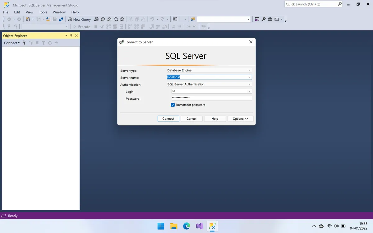
SQL Server Management Studio (SSMS)
But the worst has yet to come. Let's open SSMS, shall we?
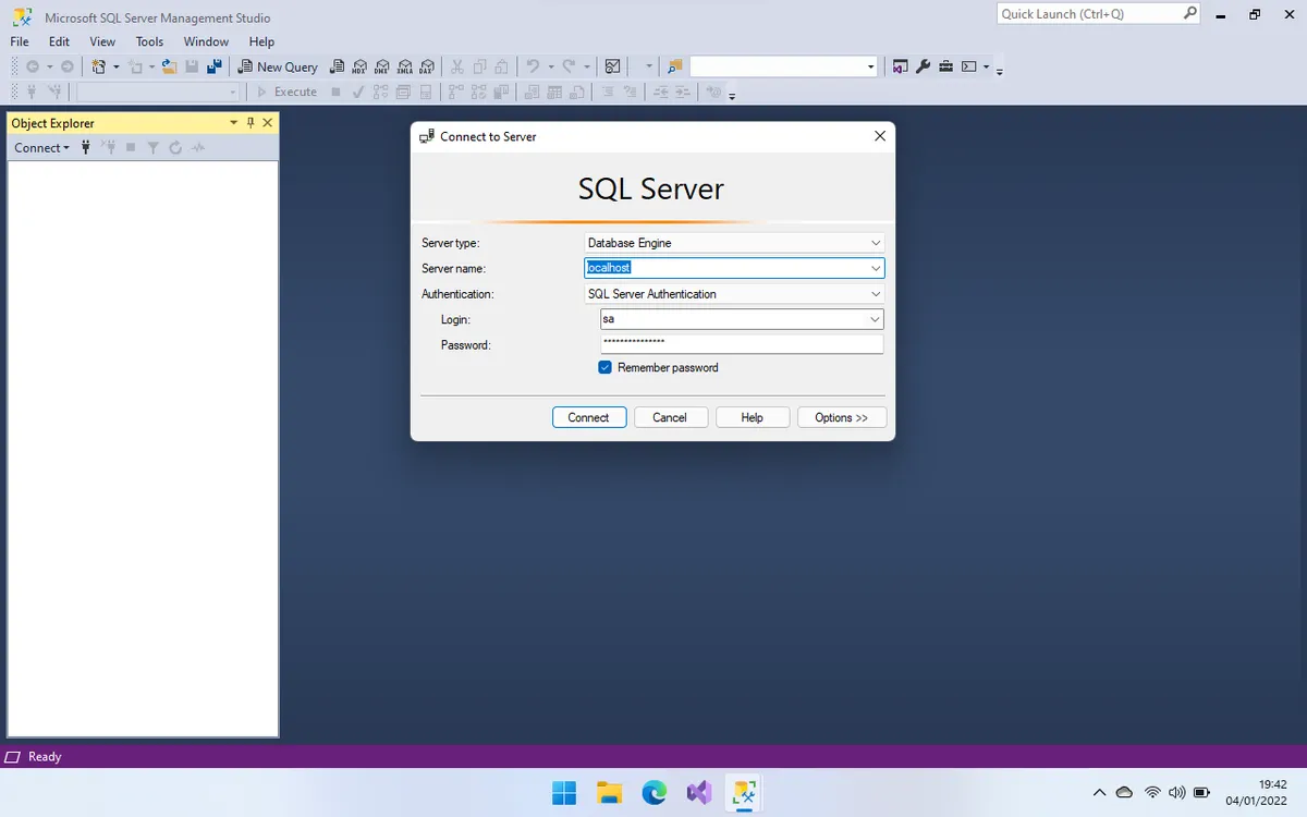 This is the SSMS Login Screen at 1x scaling. Again, pretty normal-looking...
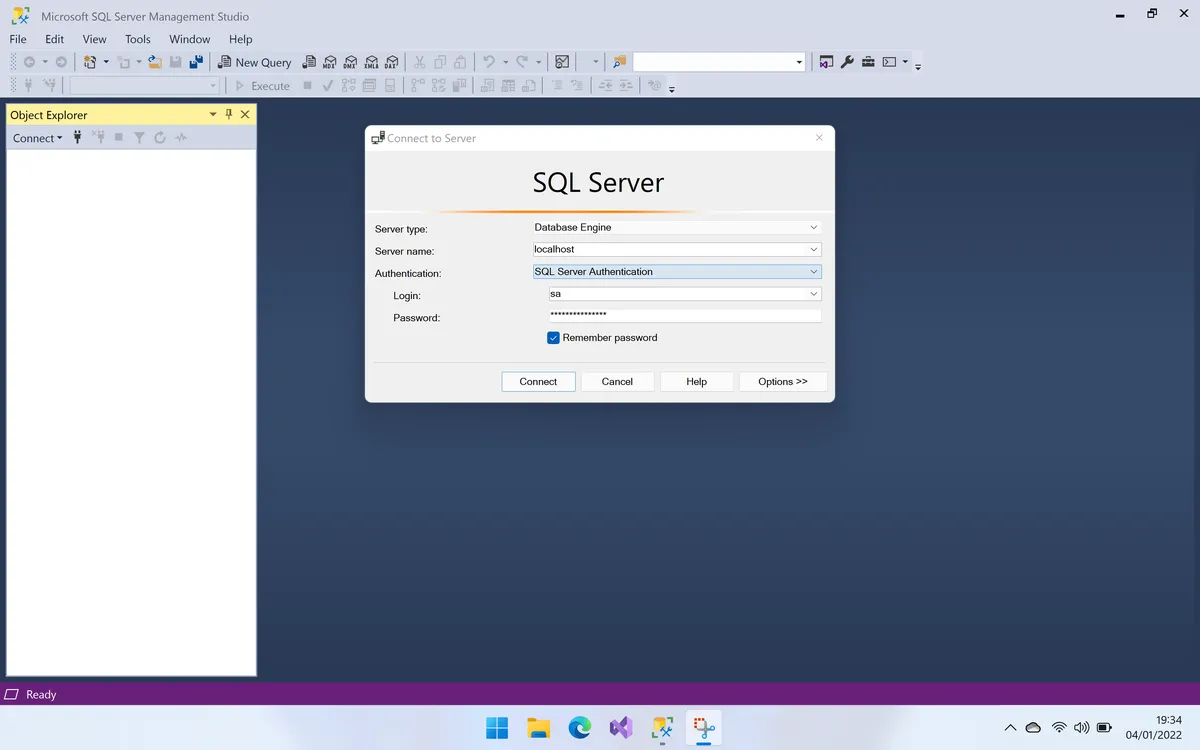
 At 2x the text scaling starts to drift (take a look at the "Connect" button)...
 And finally, at 3x, we can see the text is not where it's supposed to be.
And yes - you only see the SSMS Login Screen sporadically. So let's take a look at context menus...
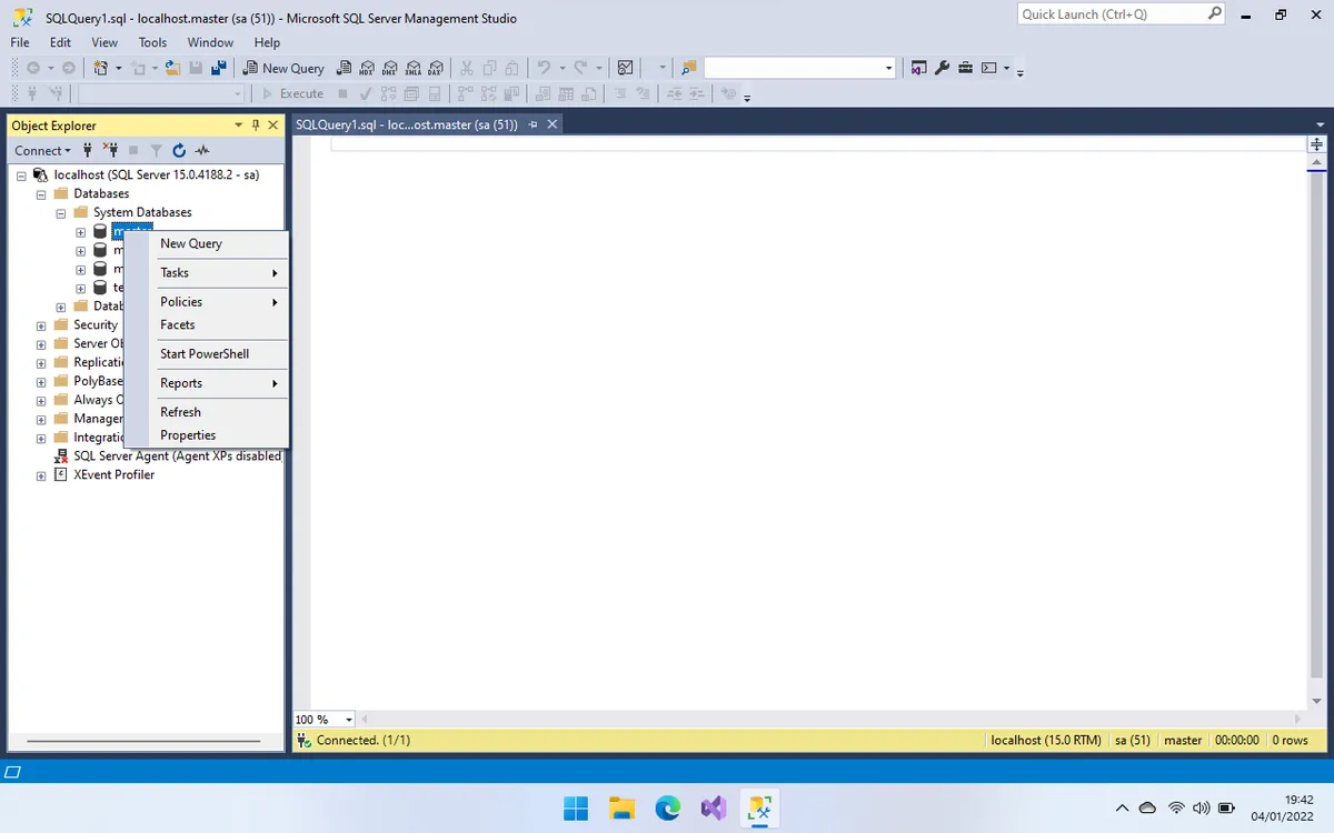 This is at 1x...
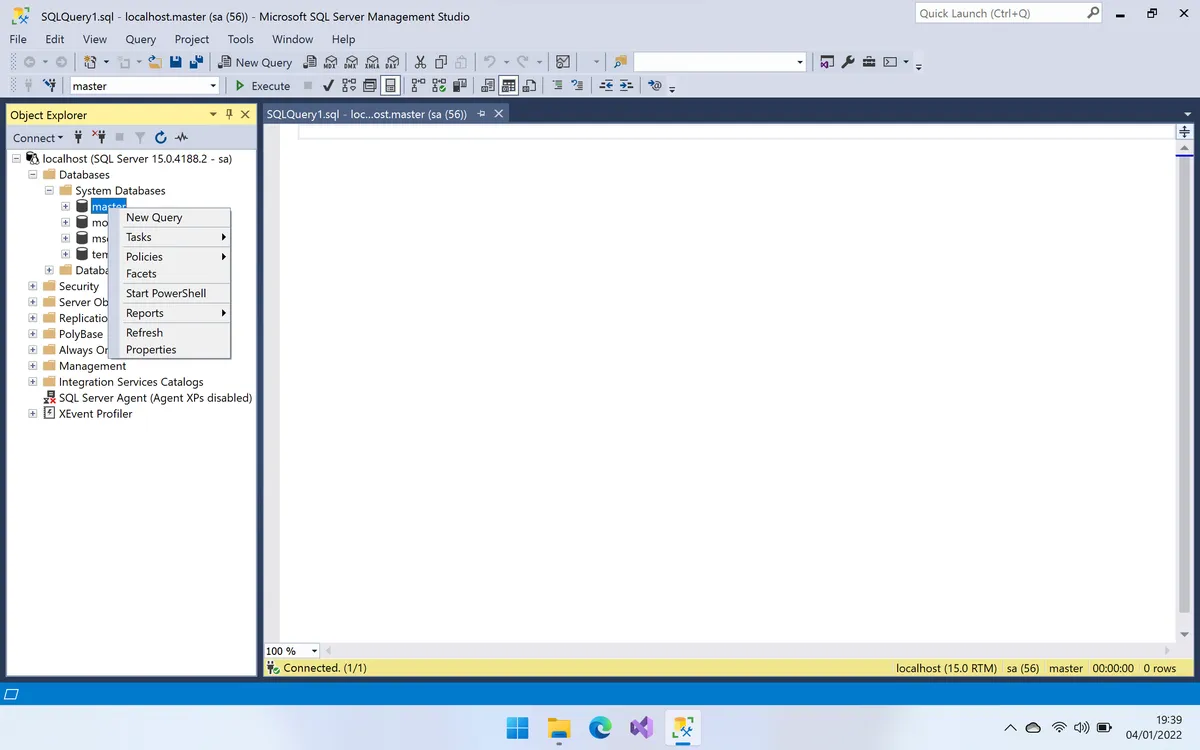 This is at 2x...
 This is at 3x...
I think this is pretty self-evident, without any further comments.
Visual Studio 2022
The only software I tried that doesn't seem to be much affected by this issue in Visual Studio. Here are the results.
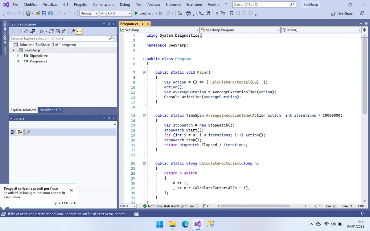 At 1x
At 1x
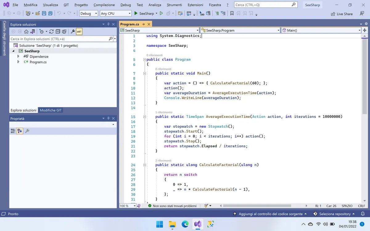 At 2x
At 2x
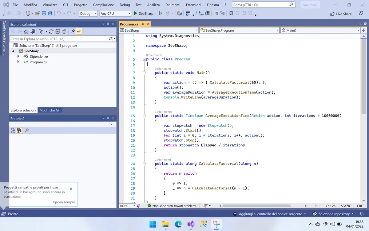 At 3x
At 3x
As you can see, it becomes sharper and sharper (so that you can effectively C# 🤪), but text and other graphical elements don't change their shape or proportions with each other.
Finally!
Final thoughts
Yes, I know this is an exquisitely first-world problem. We have many, much worse things happening around the world right now. And I don't want either to joke about severe and invalidating diseases like ADHD or obsessive-compulsive disorders.
It's just the fact that I expected more from a multi-billion company like Microsoft! Like, come on, Windows 11 is just all about graphic design. Plus, they have had partners selling PCs with Hi-DPI monitors for years now! I'm not asking for unicorns here, like consolidating the control panel in a single place... it's just catching up on 2014-era Apple technology!
And let me be clear, this was not the only reason I returned the ThinkPad to Lenovo. I did it also because the 11th gen Intel processor was almost a toaster sitting on my desk, with fans constantly spinning, while I was used to my dead-silent M1 MacBook Pro. And - most importantly - Visual Studio was objectively a worse end-to-end development experience than JetBrains Rider on macOS, so my main reason to switch lapsed.
Finally, I don't think I will give Windows another try anytime soon, or at least until I know they didn't fix this problem. I spend already too much time in front of a screen, and Windows scaling issues are another unnecessary annoyances I'd rather avoid.